Harrow London Casestudy
The rebranding of Harrow Studio included modernizing their logo and physical designs, enhancing their SEO to improve online visibility, and refining their social media strategy to better engage their audience. This holistic approach helped to create a more cohesive and contemporary brand identity.

Role
Product & Brand Designer
Company
Harrow
Problem
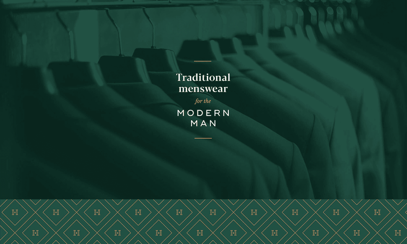
Outdated logo and physical designs that no longer reflected the modern, innovative image of the brand.
Low online visibility and poor search engine ranking, making it difficult to attract new clients.
Lack of engagement on social media, limiting the brand's ability to connect with its audience.
Inappropriate use of fonts, limiting trust and premium touch.
Solution
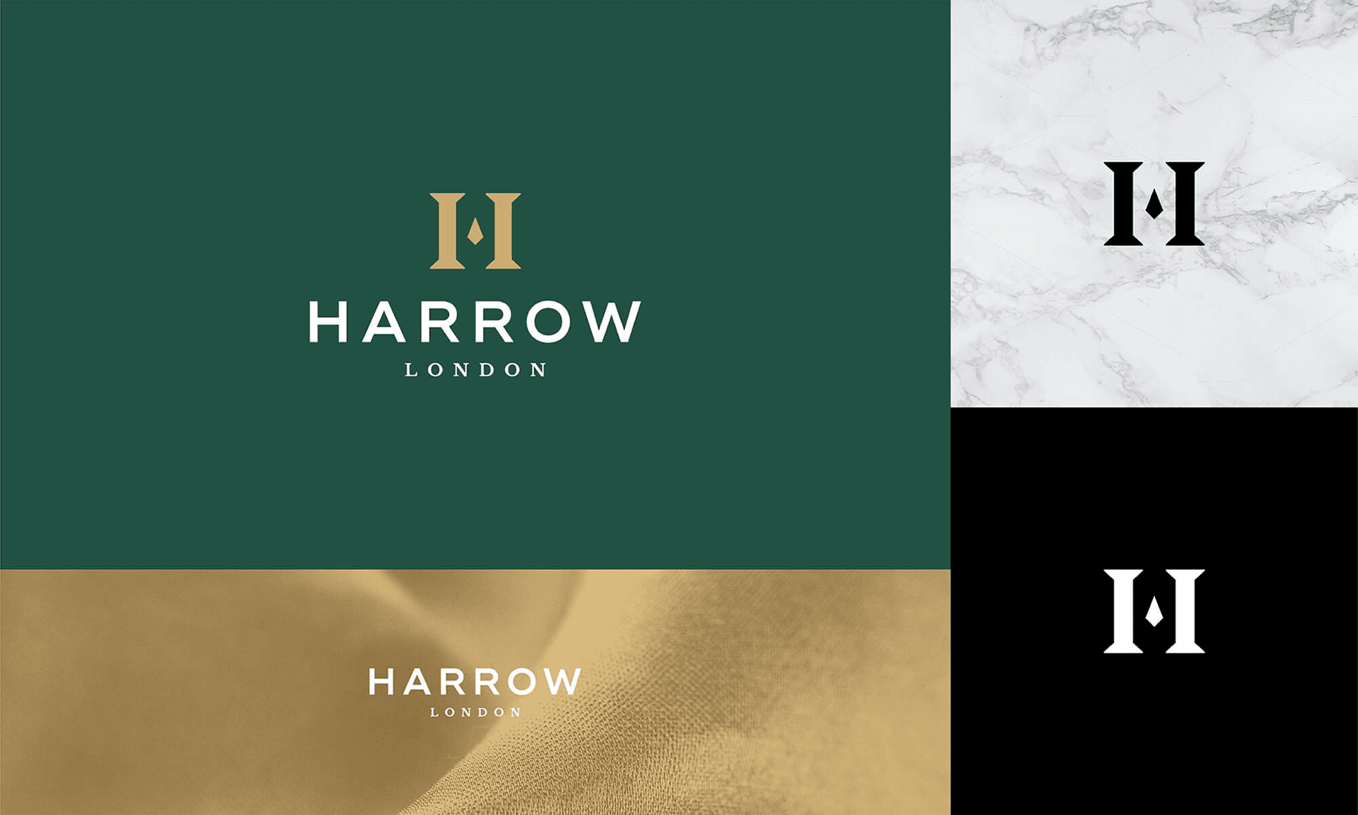
Logo: Designed a minimalist and modern logo reflecting the studio’s innovative approach.
Color Palette: Developed a sophisticated color palette with earth tones to symbolize sustainability.
Typography: Chose contemporary fonts that convey professionalism and creativity.
Market Analysis
Digital presence and engagement through social media are key drivers in attracting new clients and maintaining relevance.
Harrow Studio operates in a competitive market where standing out is crucial.
The rebranding was aimed at positioning the studio as a forward-thinking, innovative brand in a crowded design market.

Result
The rebranding and digital transformation yielded significant positive results:
Branding and Design Impact
Increased Brand Recognition: The new brand identity effectively communicated the studio’s values and expertise, leading to higher brand recognition.
Professional Image: The modern and cohesive brand design positioned Elysium Architects as a leader in innovative and sustainable architecture.